
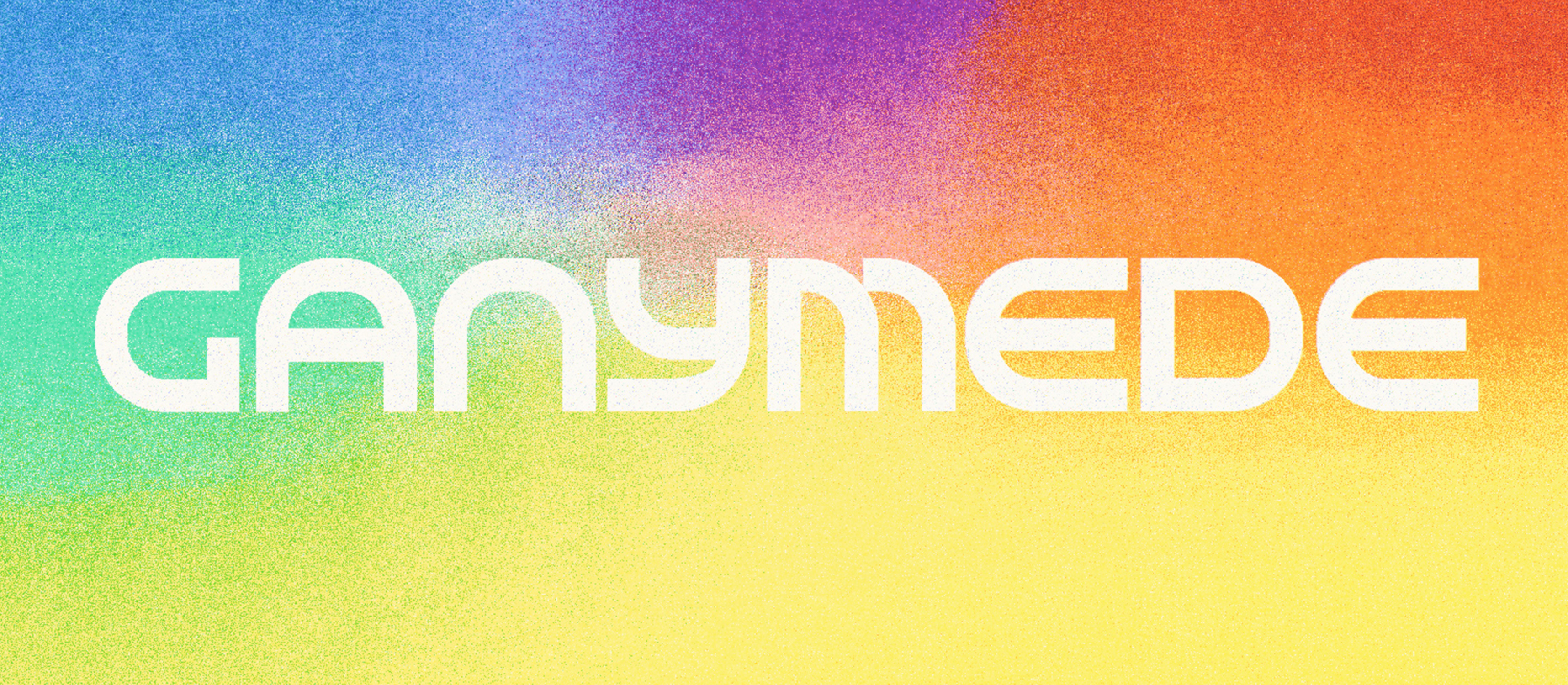
Open counters and low joins give its orbital shapes an easy, continuous rhythm.
Curves repeat across the alphabet, while clipped apertures keep every word from becoming too polite.
Set it large for titles, posters, identities, and screens that want the future to feel bright, not severe.
Headline
Subheading
Body
Ascender1000
Cap height700
x-Height500
Baseline0
Descender-200
- Font style
- Ganymede Regular
- Glyph name
- A
- Unicode name
- Latin Capital Letter A
- Unicode decimal
- 65
- Unicode hex
- 0041