
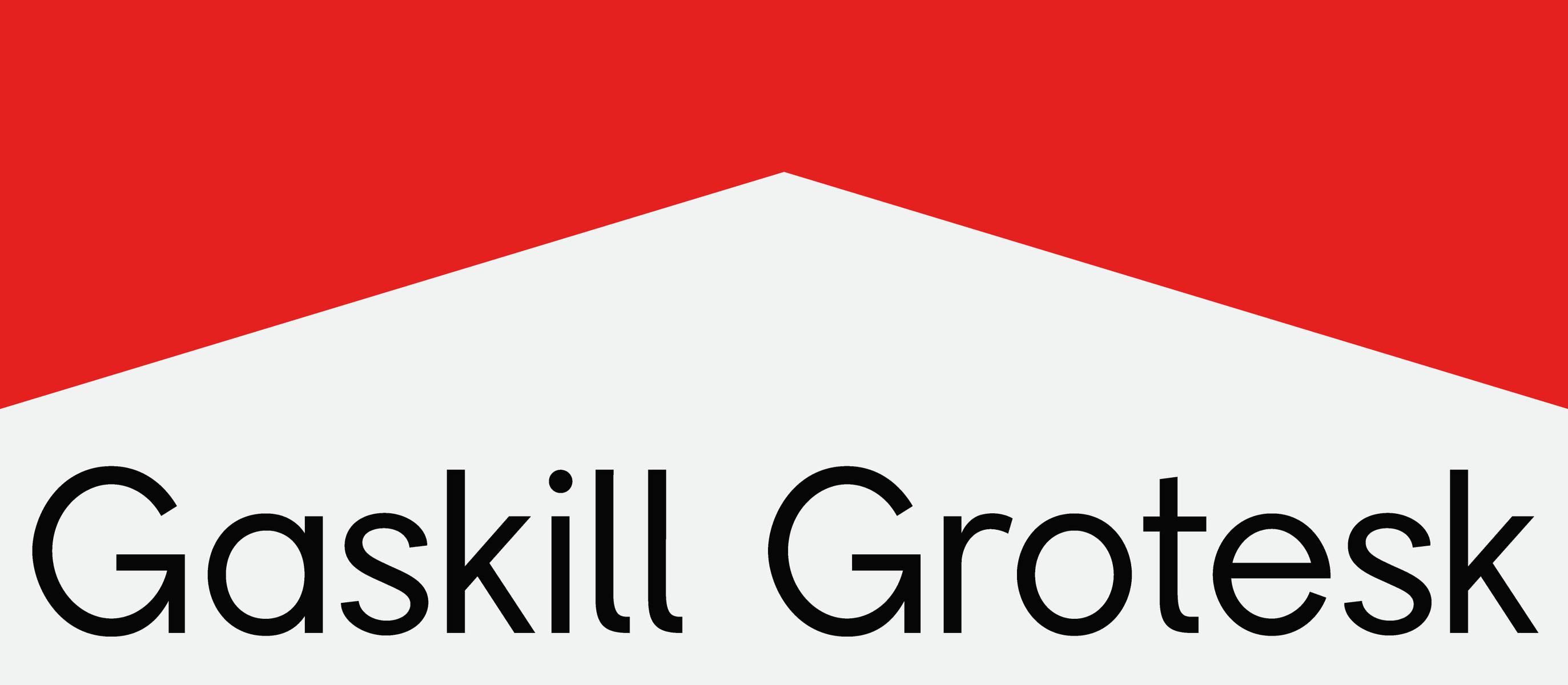
Gaskill Grotesk takes cues from early 20th-century grotesques, where simple, sturdy shapes were made for clarity above all else.
Its letterforms are straightforward and balanced, with just enough personality in the curves and proportions to keep it from feeling cold.
This blend of functional structure and subtle warmth gives it a timeless quality that works as easily in modern layouts as it would on a vintage poster.
Headline
Subheading
Body
Ascender911
Cap height700
x-Height500
Baseline0
Descender-200
- Font style
- Gaskill Grotesk Regular
- Glyph name
- A
- Unicode name
- Latin Capital Letter A
- Unicode decimal
- 65
- Unicode hex
- 0041